Font Pairing
- Nov 9, 2016
- 2 min read


What does it mean to create a font pairing?
To create a font pairing means to use one’s artistic intelligence and judgment to create a visual containing different words and fonts that is appealing to the eye and catches the viewer’s attention due to the fact that the fonts compliment and contrast each other.
What are the four assignments you chose to do? Write the name of the assignment and describe your design for each.
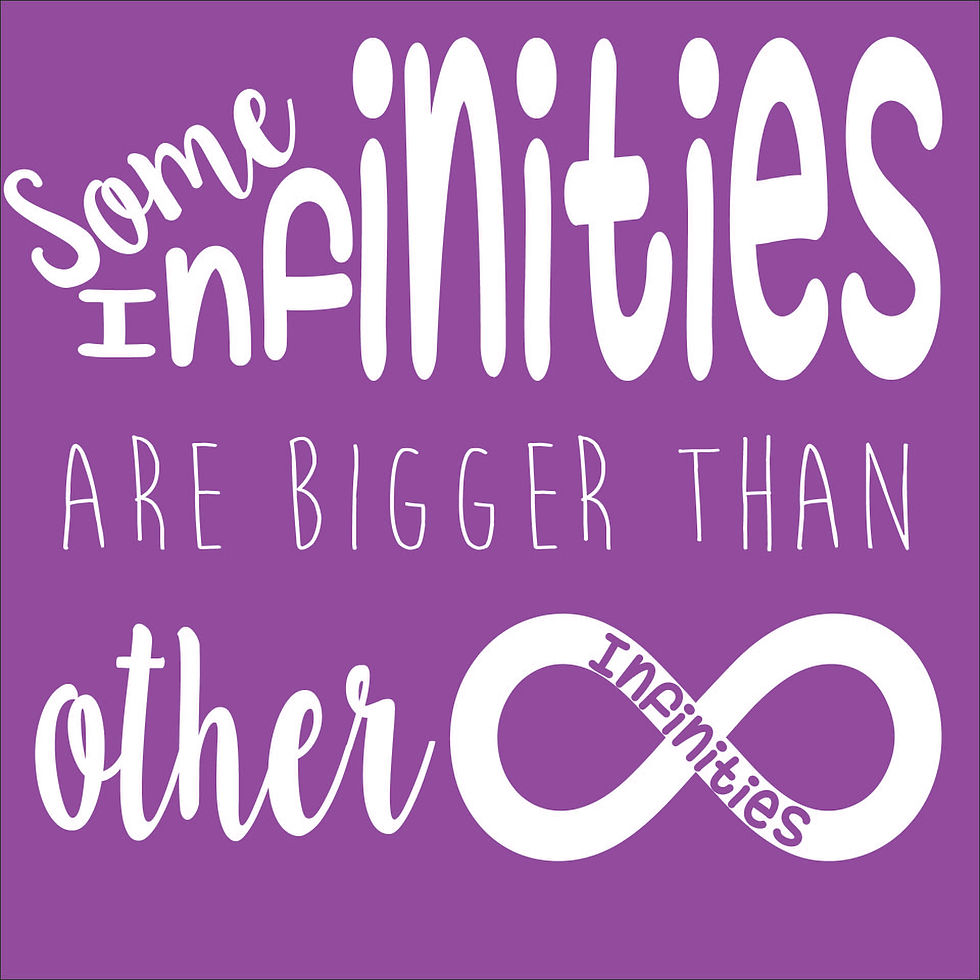
Famous Quote- I incorporated 3 fonts, 2 colors, and 1 visual. I used a thick font to emphasize the thin font, and used one script font that stands out because the letters are connected, unlike the other 2.
Destination- I used 2 thick fonts to create a sense of unity, but one of the thick fonts is transparent in the center to create a sense of variety. The fonts are simple and white in order to emphasize the detailed photo behind them.
“These are the good ol’ days”- I used neutral colors and a background of wood to give it that rustic, vintage, and crunchy appeal. In doing this, the color scheme and scratchy fonts created a visual of vintage feel.
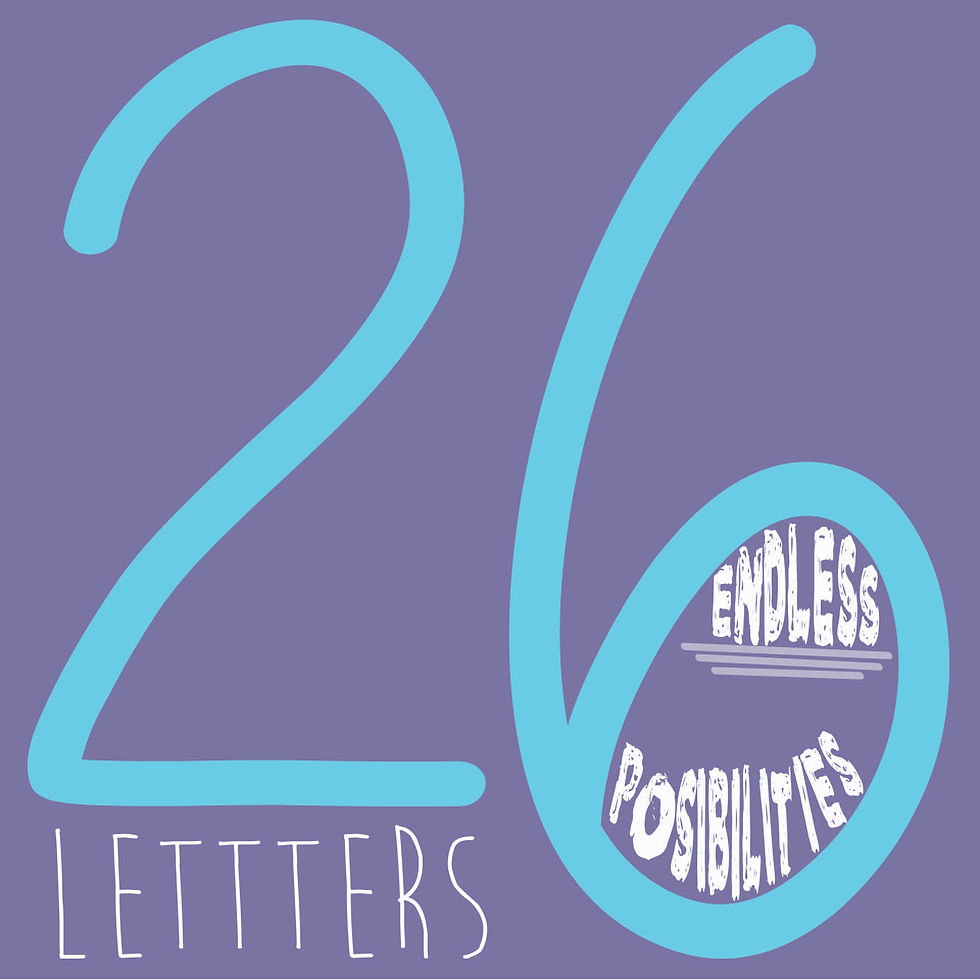
“26 letters endless possibilities”- In using 3 colors, the visual is fun and appealing to a viewer. By making the number “26” larger, which is a different font than the word “letters” and the words “endless possibilities” and underlining the word “endless”, which is a different font than the number “26” and the word “letters” there is emphasis on those 2 elements of the visual. Even making the “6” bigger than the “2” emphasizes that it is even more than 20 letters.
Which assignment would you say is your BEST font pairing and why?
I feel as though my assignment that says, “these are the good ol’ days” is the best. The color scheme is constant and the circle acts as a focal point that forces the viewer to focus on what is inside and outside of it. Outside of the circle, is a vintage-like background, and inside of the circle are neutral colors, which can be warm and inviting.
Which assignment would you say is your Least Successful font pairing and why?
I think my least successful assignment is the destination assignment. I feel this way because it’s a very simple design; it’s just linear words.
How would you describe the font pairing process? What makes a font pairing so difficult?
The font pairing process is much more complicated than I anticipated. This is because finding fonts that work well together takes a lot of thought and good judgment. On top of that, you have to know how to properly size each word, depending on what you want to emphasize. Also, color scheme can change the entire message that the words are sending (cool colors can be perceived as angry and warm colors can be perceived as calm).


Comments